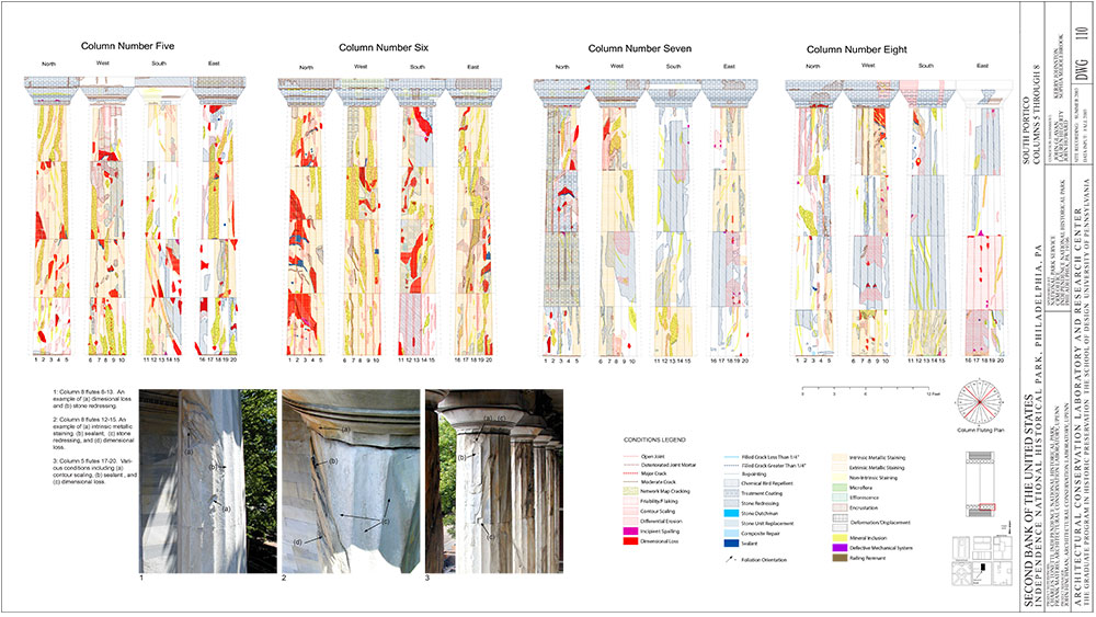
Home
Sites Map ACL Project List


meveline
Second Bank Header
Second Bank Summary
 

The Limitations of AutoCAD
Phase one of the project produced a set of AutoCAD drawings that were hatched using a unique pattern for each of the conditions that were recorded. In addition to the patterns, a second level of differentiation was added (through the use of three colors) to identify between conditions which 1) required intervention, conditions which 2) required monitoring and conditions which 3) needed simple routine maintenance. While the final product was adequate for the intended output, at the time AutoCAD was limited to only a few dozen basic hatches. Many of these conflicted with each other when layered one on top of the other, making it difficult to differentiate stacked conditions. In addition to conflicting patterns, hatches did not scale making the conditions hard to identify when zoomed. One additional problem was the patterns of the hatches themselves. Many of them were associated with existing materials as a result of their very common use in standard architectural drawings. While it would be highly unusual on a masonry building for anyone to mistake an irregularly shaped polygon for steel (due to the hatch pattern),  it was apparent that under different circumstances this type of confusion might become a problem. 

The Advantages of ArcGIS
While the Second Bank is clearly architectural, the function of the structure should not be the impetus behind using “architectural” software to convey conditions which are being “mapped” onto its surface. As such a decision was made to use ArcGIS for our final drawings and there were several benefits that were identified as a result of switching to this software for production.
ArcGIS
While appearing similar in many ways to the hatching of AutoCAD, the options in ArcGIS were more varied, allowing for drawings that were easier to read.

ArcGIS is a software which is highly ubiquitous but in the associated fields of architecture is not as common as AutoCAD since it is not a software intended for designing buildings. Used by mapping companies as well as hundreds of other fields interested in “spatial” data, it is a software that is most commonly associated with global data. It allows data to be “mapped” in stacked layers, each of which can be compared or interconnected spatially to each other. The ability to connect data between layers is one of the aspects that makes ArcGIS unique but was not the initial motivation for its use in this project.

The first clear benefit of using ArcGIS for the Second Bank final drawings was its more flexible hatching options. When using AutoCAD, each individual polygon needed to be independently filled in or “hatched” which was time consuming.  In ArcGIS closed polygons were automatically filled in eliminating the need to “hatch” our conditions, reducing the overall time to complete the drawing set, and polygons with common attributes were all filled with the same pattern. While this alone was a benefit, ArcGIS also offered a virtually limitless set of patterns and colors which could be used to represent given conditions, helping us to avoid the difficulty we had using previously associated patterns in AutoCAD.  Finally the hatch patterns used in ArcGIS scaled with the drawing. Any area of the building where details were important could be easily zoomed in without loss of the integrity of the hatch pattern, which allowed us greater flexibility with what we displayed in the final drawings. Scale bars were easily inserted, which like the hatch patterns, also scaled when a drawing was either zoomed in or out. All of these benefits provided for a better quality drawing which was easier and faster to produce.


GIS
Above:  In addition to superior graphic options, ArcGIS easily allowed us to look at our data differently by representing quantities of a given condition through the use of a gradient scale.
The Second Bank project provided the ACL with a solid lesson in the power of connections between softwares. While ArcGIS proved to be a better graphics software for displaying the data, AutoCAD proved to be the better choice for drawing the conditions, and knowing how to move seamlessly between them was critical to the project's success.
columns
AutoCAD's superior drawing options allowed for a  clean and highly accurate drawing of the building and its conditions, but the hatch options in CAD were limited, resulting in drawings that offered less flexibility for visualization.
The Superiority of Using Both

Although ArcGIS proved to be the better option for final output due to its flexible hatching options, these drawings would not have been possible without the superior drawing ability of AutoCAD. Like ArcGIS,  AutoCAD’s interface allowed for full scale drawing, however the AutoCAD software encouraged the use of key commands for all the drawing, which significantly sped up the process. Options like copy, offset, trim and extend in AutoCAD were far superior to those of ArcGIS, and the ability to control exactly what the cursor would snap to resulted in a more seamless and faster drawing experience.

Both AutoCAD and ArcGIS work with vector file formats, so the exchange of data between them was remarkably easy, and since the vertical nature of building elevations is not relevant to global spatial representation, the need to worry about “location” was not of great importance. Ensuring continuity with the drawings between the two softwares was easy. Once data had been moved from AutoCAD into ArcGIS we simply needed to be certain not to move, or reorient our data in either software. Adding new data without having to work with the entire drawing simply required the use of "w-blocking" in AutoCAD. In comparison to the conditions survey work carried out in 1999, the time using AutoCAD was noticeably reduced due to the benefits found in ArcGIS, although there was still time needed in ArcGIS to create appropriate graphics for each condition. Making pattern and color choices for each given condition in ArcGIS was initially time consuming, and while the final Second Bank drawings were superior in a wide range of ways to those made in AutoCAD, our final product could have been improved with additional time to work though the best options for display.

Still there was a sense that some of what AutoCAD offered for output was missing in ArcGIS. Graphically ArcGIS offers a way to establish an almost limitless set of clearly defined and scalable displays through the use of color and line weight, but what was noticeably absent was the advantage offered by AutoCAD's CTB files. CTB files allowed line weights and colors in the AutoCAD drawing to be predefined before the drawing process began, eliminating the need to individually change those variables after the drawing was complete, but the result of using a CTB in AutoCAD was not transferred to the GIS interface with the data. While ArcGIS provided the ability to use LYR files for similar purposes, they were not as easy to work with. Additionally, the layering system in AutoCAD allowed lines from a common element to have different line weights helping to enhance the sense of depth which can be so important in architectural drawings. This is not to suggest that ArcGIS doesn’t allow for variable line weights but assigning those subtle variations in ArcGIS proved to be more time consuming and difficult.

Below:  An example of one of the pages from the final drawing set. This drawing shows 4 of the columns of the south elevation.To see the entire set of drawings go to LIBRARY AND LINKS.

columns page